The Color of “Safe”
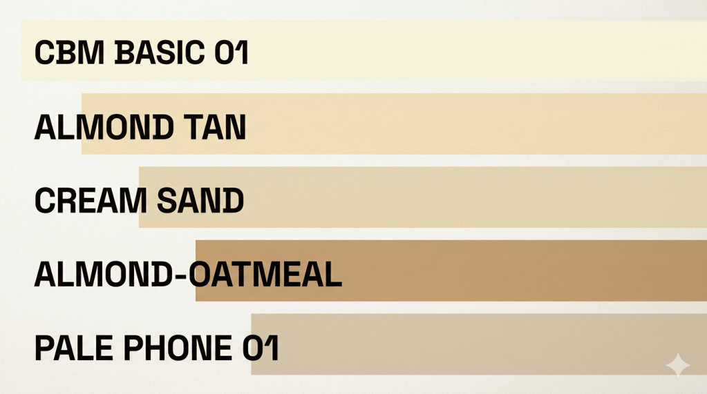
There was a time when entering almost any room felt like stepping into a softened version of reality. Walls, carpets, office partitions, kitchen appliances, even the cars in suburban driveways—so much of it seemed to settle into beige. Not white, not brown, not anything that demanded attention. Beige. A color that didn’t argue with the eye.
It wasn’t an accident, and it wasn’t simply a lack of imagination. Beige was what happens when design stops trying to express personality and starts trying to avoid problems. It was the visual equivalent of clearing your throat and deciding not to say anything controversial. In the 1980s, this silence had a purpose.
Homes, workplaces, and public buildings were designed under a quiet agreement: environments should not overwhelm people. After the louder experiments of previous decades, with their bold patterns and saturated optimism, there was a cultural drift toward stability. Beige became the visual compromise between taste and caution.
It didn’t offend. That was its strength.
Corporate Calm and the Fear of Mistakes
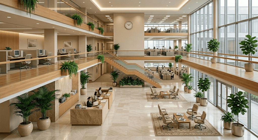
Walk into an office from that era and the logic becomes clearer. Beige walls reduced distraction. Beige carpets absorbed noise. Beige filing cabinets disappeared into the background of long workdays that were meant to feel orderly and controlled.
The psychology behind it was not just aesthetic—it was administrative. Institutions wanted predictability. A neutral palette reduced perceived chaos. In a world where computing was entering offices and automation was slowly reshaping work, there was an unspoken desire to keep everything else visually simple, almost mute.
Beige did not ask questions. It did not require interpretation. It was the color of decisions already made.
Even technology followed suit. Early personal computers, printers, and monitors often arrived in off-white or beige plastic housings, as if to reassure users that nothing inside the machine was too radical. These devices were powerful in function, but visually domesticated. They were meant to sit in rooms without disrupting them.
The Psychology of Visual Quiet
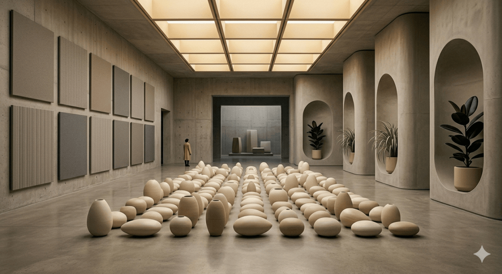
There is something psychologically interesting about sustained neutrality. When people are exposed to environments that are visually restrained, the mind begins to fill in the gaps elsewhere—through routine, structure, and predictability.
Beige spaces reduce stimulation, but they also reduce narrative. You are not being told a story by your environment; you are being asked to supply your own, or more commonly, to focus on what you are doing rather than where you are doing it.
In the 1980s, this aligned with a broader cultural rhythm. Life was increasingly segmented into defined roles: home, work, commute, errands. Beige helped enforce those boundaries. It did not compete for emotional attention. It simply held the edges of daily life in place.
There is a subtle psychological trade-off here. Too much stimulation can feel chaotic, but too much neutrality can begin to feel like absence. Beige lived in that tension without resolving it.
The Illusion of Permanence

Another reason beige dominated was durability—not physical durability, but perceived longevity.
Trends change quickly when they are expressive. Bold colors tie themselves to moments in time. Beige avoids that trap. It suggests continuity. A beige sofa does not feel dated; it feels like it has always been there and will continue to be there.
This mattered in a decade increasingly defined by consumption cycles that were accelerating beneath the surface. Products were being replaced more frequently, even as their appearance suggested stability. Beige was a kind of visual promise: this will not go out of style because it never really entered one.
In hindsight, it becomes clear that this was part comfort and part illusion. The world was changing quickly in technology, finance, and media, but interiors often resisted reflecting that pace. Beige was a buffer against the feeling of change itself.
The Domestic Landscape of Restraint
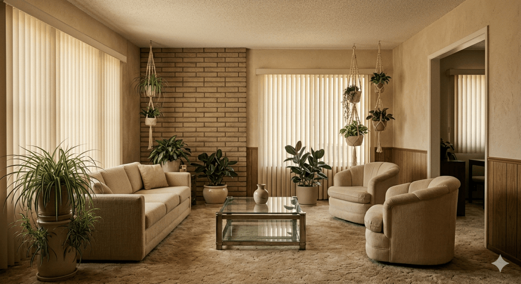
Inside homes, beige often carried a slightly different emotional weight than it did in offices. It was warmer, more intimate, but still cautious. Living rooms tended to blend creams, tans, and soft browns in ways that avoided strong contrast. Kitchens leaned toward muted cabinetry and subdued tile patterns.
This was not a lack of care. It was a different definition of care.
A well-kept home was not necessarily a visually exciting one. It was clean, coordinated, and unlikely to age poorly. Design choices were guided by resale value as much as personal expression, even if that language was not always explicit. Beige performed well in both categories.
There is also something worth noting about memory here. Many people remember these spaces not as visually striking, but as emotionally consistent. The beige environments of the 1980s often feel, in retrospect, like containers for life rather than statements about it.
When Beige Started to Fade
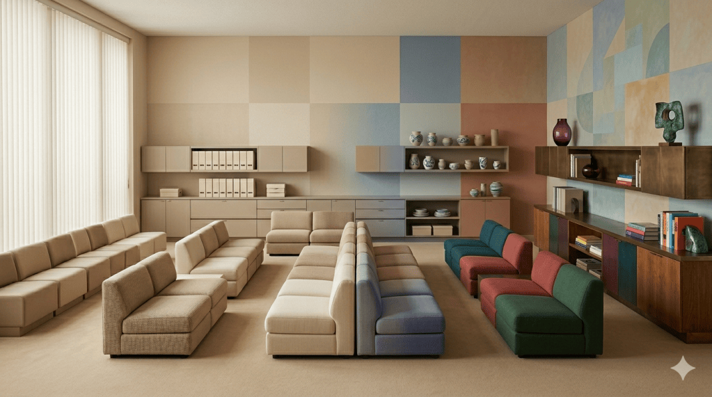
Beige did not disappear suddenly. It loosened its grip slowly, as cultural confidence in visual expression returned. By the late 1980s and into the following decade, color began to reassert itself in design, fashion, and media spaces.
This shift was partly technological. New materials and manufacturing processes made color cheaper and more varied. It was also cultural. As media expanded and aesthetics became more global, visual identity started to matter more again. Environments were no longer expected to simply function—they were expected to communicate.
Beige began to look less like neutrality and more like hesitation.
But its legacy remained. Even as color returned, the logic of restraint did not disappear. It was absorbed into a more complex design language where neutrality still had a place, just no longer the dominant one.
What Beige Actually Meant
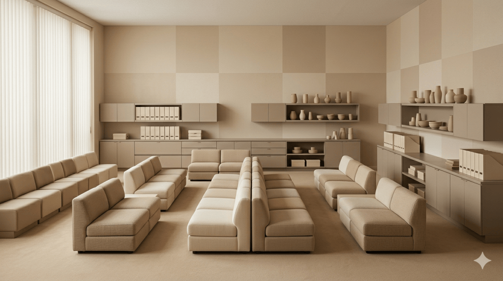
Looking back, beige was not about the absence of creativity. It was about managing uncertainty.
It represented a time when institutions, manufacturers, and households were all negotiating the same question in different ways: how much visual risk can we afford in everyday life?
Beige was the answer that required the least risk. It did not promise excitement. It promised continuity. It asked for trust in systems rather than attention to surfaces.
And perhaps that is why it feels so distinctive in memory now. Because in trying so hard not to stand out, it ended up defining an entire visual era.
Not loudly. Not even clearly.
Just steadily, in the background of everything.


Leave a Reply